Article Index

We might as well admit it. We all judge a book by its cover. But in our defense, before we've opened the book, the cover is all we have.
Facades serve as an invitation. The path leading up to your front door is an invitation to come inside and have a look. If the cover, or the front door, or the outside of the restaurant looks inviting, we might venture closer.
If not, then we probably won't. It's human nature.
We know this is true about our churches as well. We spend time and money on landscaping for this very purpose. That's why we have greeters, and people directing traffic, and why we care about what the sanctuary looks like. We know people judge a book by its cover—and don't want them to walk away before they start reading.
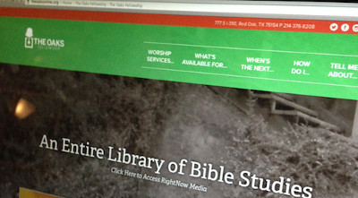
Now comes a question: What does your website look like?
Statistics tell us that people will judge your church by its website. Is it just a plain page with bare-bones information? Is it the same one someone's uncle made for free 10 years ago? It is flashy and packed with information? Is it inviting?
We spend time and money on what happens in our churches, and even what the outside looks like. But I wonder if we spend as much time, care, and intentionality on our websites.
If not, we should. The importance of our websites cannot be overstated.
Here are five things every church website needs:
1. Style. Your website doesn't need to be the trendiest thing, or complex, or high-tech, but the way it looks needs to reflect who you are as a church. A bad logo or a poorly functioning site says a lot about who you.
Churches officials who know who they are and what their church is about reflect that in every nook and cranny. Their culture and values seep into every crack of their church—from the way they give announcements to the way they answer the phones. This includes their website.
These days, there's no excuse to have a bad website.
They are inexpensive and easy to make. And forget Microsoft Paint; there are great graphic designers out there who can help you create a brand for your church, helping people know who you are before they even step through your doors.
2. Straightforward information. When accessing a church's website, people usually want to know two things:
- Where is the church?
- What time does the service start?
Label this information clearly and make it easy to find. These are the things people want to know—give it to them straight. Don't make them work for it, cluttering the site up with every single detail.
3. Your best foot forward. That brings me to my next point. When creating a website, people feel the need to include every single detail about their church. This is not your church's historical records or information database. This is a means of communicating information that should be simple and intentional.
Decide what information is most important—what you most want people to know about your church. Delete the rest. It won't give them more information; it will cloud the information you really want them to see.
4. Access to old sermons. Having an online collection of your teachings used to be a nice bonus, but it wasn't expected. Now it is. People go to a church website expecting access to past teachings. They'll want a sample of what your sermons are like or what it's like to be a part of your church.
Some of your congregation might be overseas and wanting to attend church virtually.
Some people might be down the street and wanting to attend church virtually.
This is a huge ministry opportunity for you, and it's also expected. Get some good recording equipment, and make sure your teachings are online and easy to download.
5. A statement of belief. Plain and simple, before people come to your church, they want to know what you believe. Taking the time to craft your statement of belief is a great practice for you as a church, but it's also important for guests as they're deciding where they want to make their spiritual home.
What does your website say about your church?
With more than a dozen years of local church ministry, Justin Lathrop has spent the last several years starting businesses and ministries that partner with pastors and churches to advance the Kingdom. He is the founder of Helpstaff.me (now Vanderbloemen Search), Oaks School of Leadership, and MinistryCoach.tv, all while staying involved in the local church.
For the original article, visit justinlathrop.com.
Get Spirit-filled content delivered right to your inbox! Click here to subscribe to our newsletter.
Dr. Mark Rutland's
National Institute of Christian Leadership (NICL)
The NICL is one of the top leadership training programs in the U.S. taught by Dr. Mark Rutland. If you're the type of leader that likes to have total control over every aspect of your ministry and your future success, the NICL is right for you!
FREE NICL MINI-COURSE - Enroll for 3-hours of training from Dr. Rutland's full leadership course. Experience the NICL and decide if this training is right for you and your team.
Do you feel stuck? Do you feel like you’re not growing? Do you need help from an expert in leadership? There is no other leadership training like the NICL. Gain the leadership skills and confidence you need to lead your church, business or ministry. Get ready to accomplish all of your God-given dreams. CLICK HERE for NICL training dates and details.The NICL Online is an option for any leader with time or schedule constraints. It's also for leaders who want to expedite their training to receive advanced standing for Master Level credit hours. Work through Dr. Rutland's full training from the comfort of your home or ministry at your pace. Learn more about NICL Online. Learn more about NICL Online.


